QIHUA YU

TRIPCIPE
ISO APP - Group Project
2017.10 -11
MyRole:
UI Design/UX(Research) - I led and conducted the User Interview, Competitive Analysis, User Flow, Contextual Inquiry. Also, I joined the process on the Sketch, Wireframes, Visual Mockups, and Prototypes.
Team Member:
Qihua Yu,
Jason Jia,
Wanli Hu,
Icey Zhao ,
Jay Kao,
Sijia,
Tiffany
Tools:
Sketch,
Principle, Photoshop
Case Contents
Design Overview
Design Challenge
Design Process
Design Delivery
OVERVIEW
We worked as a team to design a travel app that solves the challenge of users struggling to plan their weekend trips or short trips. The app is a one-click route generator which suggests personalized trip plans based on users' interests, hobbies, and recommendations. It helps users view, select, and download the generated route easily. Also, the generated route can be shared with other users.
Challenge
Design Goals
The users want an easy way to plan and select a trip route after a long week of work, but currently struggling with:
1. User find it hard to balance planning, cost, travel distance, open schedules, and safety. It makes user are hard to make a decision.
2. Too difficult for users to expend the time and energy on the discovery of something exciting or new.
3. Users find it hard to review all the details of their itinerary.
Tripcipe should help users easily plan a weekend trip after the busy, frustrating long weekday, inside the app by allowing users to:
1. The app would generate a personalized route that meets users' interests, and hobbies.
2. The app would provide relevant recommendations that optimized users interests.
3. Users can easily review, download and share the route.

Design Challenge
DESIGN BACKGROUND
One of my teammates was a mother with a two-year-old. She said that it is hard to plan a trip for a weekend with her family but they still want to get out of the house because it’s better for all of them. "My kid couldn’t stay at home. Usually, me and my husband used to have a serious headache to care for our active and happy boy at home.” After a weekday work, she and her husband were pretty tired, so it was important that the app be easy to use. Planning ahead also led to less frustration as the weekend approached.
Another of my teammates claimed the same issue continually happened to their family: they were bored on the weekends and too tried to plan anything. Therefore, we decided to find a solution to her challenge as well, “Why is it so hard to plan a trip for a boring weekend”
THE PROBLEMS

Planning even a short trip was an overwhelming and frustrating activity that caused people negative emotions. They didn’t have the energy to make a big effort. Working as a group, we focused on why users felt tired from planning their weekend trips and we created a specific solution to meet this challenge.
I concluded the problem statements were:
1. It’s difficult to plan a weekend trip after a long busy weekday of work. People found it hard to balance planning, cost, travel distance, open schedules, and safety. It was difficult for users to make their final decision and develop a completed trip.
2. Users were reluctant to go to a place where they had never been. It seemed too difficult for them to expend the time and energy on the discovery of something exciting or new. They needed quick recommendations and quick choices for travel that could that help them feel refreshed.
3. While traveling, there was no way to guarantee open dates. Users found it almost impossible to remember all the details of their itinerary.
Design Process
USER RESEARCH
How do users plan a weekend trip?
I conducted eight user interviews with individuals who had travel experience. I followed a contextual inquiry with the master-apprentice method to develop a mental model for users in the process of trip planning. I was able to identify the tools or apps (artifacts) that they used during their planning process.
I asked questions about how they planned weekend trips, how they chose the distance they were willing to travel, their concerns during the trip, their biggest challenges in previous trips, and where they found agreeable suggestions for travel.
Then we used the KJ method (affinity diagram) to identify the key user insights from the interview materials (data) and overall user journey.


User Journey - Trip Planing Process

Insights
These early insights reflect the difficulty of planning short weekend trips. I extracted and organized them into three groups based on user reaction. It helps me to understand what design direction to work on.

Users - Personas
I developed two personas based on the finding from user research.


COMPETITIVE ANALYSIS

Evaluate Ideas
After gathering user research and competitive analysis, our team came up with many ideas. However, discussion became over discussion which led to diverging from the topic. As a way to prioritize and regain focus, we reviewed other travel apps and found they addressed common challenges now familiar to us.
I determined that the way to prioritize our design was to base its elements on their importance to users and their distinction from competitors.

Design Goals
After I evaluate the ideas, I decided our solutions should focus on three design goals.
-
The app would generate a personalized routed that met users' interests, and hobbies.
-
The app would provide the relevant recommendations that optimized users interests.
-
Users can easily review, download and share the route.
Design Delivery
IDEATION
User Flow

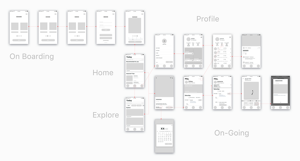
Wireframe
ITERATIONS
I conducted guerrilla user testing with 6 users to gather the iteration results. During the test, I gave users tasks such as creating a route and trying to browse maps ongoing during the route. From the data, I surmised 3 major takeaways.

Iteration 1: Homepage
In our original design, users needed just one click on the home page to generate a route, However, user testing results indicated that users needed more options from which they could make a choice. Therefore, we redesigned the homepage and improved the homepage based on user preferences.
During user testing, one user said, “On the main page, it feels too empty. It makes me confused and hesitation, I am not sure how to make a choice.” Also, based on my own observations, there were four users that required more than 5 clicks to initiate their itinerary.
So we decided to show users sequential images that are numbered to give more information and direct the user to a better understanding of the itinerary they could create.
In the end, I broke itinerary creation into two steps. When users click on their final itinerary, the user will jump to the next page, an “itinerary review page.” At that point, the user can see complete information about the whole itinerary.

Iteration 2: Explore Page
It turned out that one of the major questions for us was how to optimize user interest. As a solution, we decided to design one additional page that allowed users to have a better experience in searching for locations, suggesting more itineraries, and showing clear categories of itineraries.
In the old version, users reviewed a list style display of their itineraries. In user testing, 3 users finished the review. A display of 6 content items took less than 5 seconds before jumping onto following pages. It means they pay less attention to major itinerary content. One user complains, “it looks like all the contents are the same.” We designed segmented controls to organize content into categories, which lead users in a clear direction to select the contents that related.
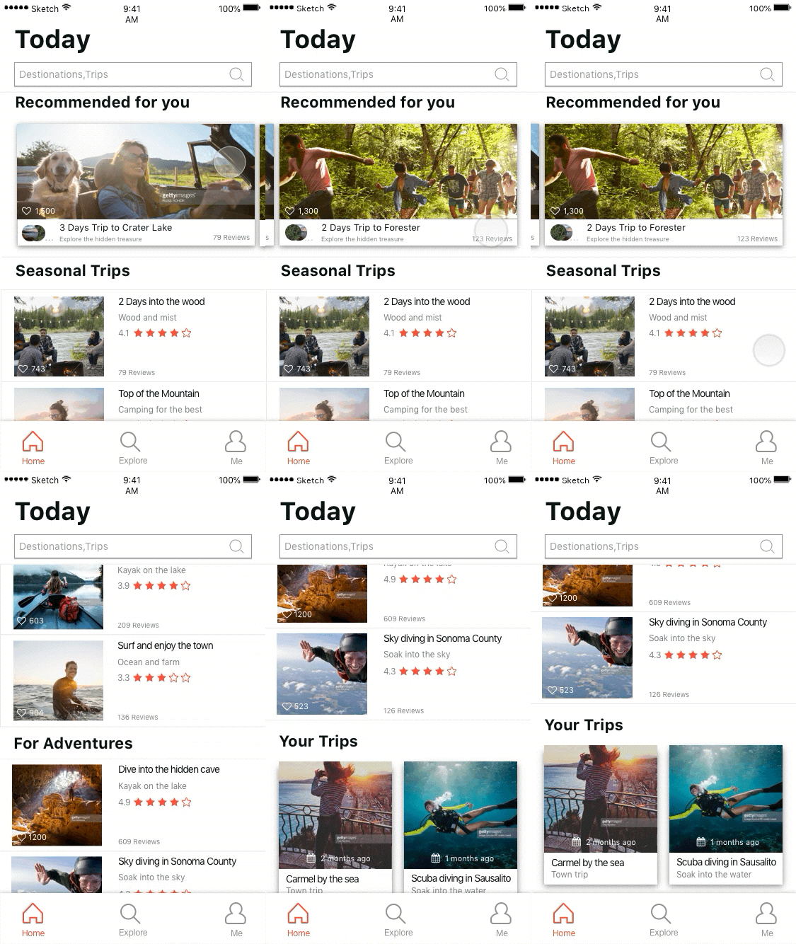
We also redesigned the content display to offer some visual breakdowns. For example, following every three horizontal elements, we then added a vertical element to relieve visual fatigue. Also, the vertical elements that allow users to delete which let users spend less time to browse more contents they like.


Iteration 3: On-going Page
While exploring the old version, two users told me that they would like to review maps on the ongoing page.
Actually, even in the old design users could directly tap the little map icon could link to Maps but accessing the feature caused a lot of confusion. To solve this problem, we decided to add a map view at the bottom of the screen. When users open an ongoing page, they can click on the map and review the detail about the location and also see travel tips without losing their place in their process.
Another user lets us know that the page was too small to review. So we created an interaction responsive design. When users browse this page, the main image zooms into a small section to optimize the visual space. And we redesigned the layout of the content to let user has a better reading experience.

UI DESIGN

NEXT STEPS AND REFLECTIONS
-
We are looking to improve the visual design and shape all UI elements to pixel perfection.
-
We should gather more user behavior data for our performance measurements.
-
We should also design cross-platform features for Android, tablets, and a responsive web version.
This was our first UX project and we are very proud of it. We experienced some troubles and we made some mistakes in the process, but we still enjoyed the project work start to finish. I learned two lessons that stand out:
Stay focused on a firm design goal. Don't over diverge on ideas when brainstorming. Test ideas as early as possible and keep asking users to help the team generate the best answers.
Understand what kind of design method is best for the product or for a project. Designing for the real world means linking a solution to a mechanism. Measure all relevant data carefully to confirm the best implementation of the product.