QIHUA YU

WIGSIGHT
Saas Web - Group Project
2017.12 -2018.1
MyRole:
UI Design/UX(Research) - I Led and conducted the User Research, Competitive Analysis, User Journey, UI, and final Prototype.
Team Member:
Qihua Yu,
Grace Han,
Siting,
FengFeng
Tools:
Sketch,
Principle, Photoshop
Case Contents
Design Overview
Design Challenge
Design Process
Design Delivery
WHAT IS WIWIDE?
Wiwide (wiwide.com) is the Number One wifi network provider in China with services to more than 300,000 business sites and in 17 airports. Their ultimate goal is to establish a unified communications environment for business owners working off line to enable significant improvements in meeting their business goals.
Wisight is a Saas product from Wiwide critical to targeting the overseas market. The product provides a back-end platform that can intelligently manage and collect data from their hardware infrastructure using their wifi routers. It helps business owners to improve and integrate their business strategies in activating, attracting, and awakening current and incoming customers by significantly enhancing the overall customer lifetime value (CLV).
Wiwide is not only intended for China’s market. The network provider is using Wisight to explore overseas markets. However, the company received feedback from customers about the lack of product features. The UI, customer surveys showed, appeared out of date and was awkward to use. To resolve these shortcomings, Wiwide invited our team to join with Wisight’s development process and work to create a new generation design and to improve the product’s existing features.
I initiated and led the UX research for the project including user interviews, competitor analyses, elements of the UI design, and the final prototype.
In conducting our research, my team identified key insights and pain points. We took our ideas through multiple rounds of evaluation, iterating the design to arrive at the final deliverable.
All Over Features
According to PM's feedback, users think that the Wisight product is hard to use and the UI is outdated in its look & feel.
However, the product has an interface for the business end user as well as the customer end user. I decided I would initiate the case study in two phases to better resolve this challenge.
The case study had two spears, one for a business end-user case study and a second for customer end study.
CHALLENGE?
HOW TO START?
To get a better understanding of the product, we spent 2 weeks and held several online meetings with both the project manager and the product manager to review all the details about the product.
Based on our team discussions and the meetings, we combined product details, product strategy, and target market to created this product goal.

Taking the product goal under consideration, we communicated with the Product Manager about the planned study. Next, we conducted a one-month long on-site product study which included contextual inquiry, interviews, and user testing to identify the challenges, and we synthesized our findings into the operational process of this product.
We recruited 8 users who had familiarity with using similar management products. We conducted interviews at the start and after their sessions. We also recorded their interactions and behavior. To fully understand user behavior and gain additional insight, created a user journey map to understand the product cycle from start to completion.
Highlight
Enterprise users access the Wisight platform on different devices. They gather data showing their customers’ behavior as a way to review how they perform. Then they make business decisions based on what they learn. In addition, after enterprise users complete an analysis of customer data, they want to promote their product and send advertisements and coupons to that match customer favor to increase customer retention rates.
They needed to create a wifi login page as a bridge between enterprise users and customers. The contextual factors that affect enterprise users are clear and simple systems, intuitive data visualization, and easy linear steps for logging customer data.

Problem 1: Reconstruct the Information Architecture (IA)
Business End Case Study –
Any first-time user should be able to find the right tool quickly. When users entered data on the platform, 6 out of the 8 users spent more time than what we expected. Their eyes repeatedly tracked over and over the main page to find the correct tools. Users vocalized that “it is hard to find the right tool; it seems everything is stacked together.” Combining our user journey map with our user testing data clearly indicated that the information architecture should be remodeled.
Thus we developed our first design goal: make the product easy to use.
we found out that the old version can not accommodate further application development and changes.

Problem Indicated From Old Version:
Almost all user cannot figure out what does these terms means and got confused to finishing tasks.
Then I conducted the comparative analysis to find out what our competitor design and how we can do improve on our design.

Here just a part of our finding
1. They divided major section on the top.
2. left menu bar clear and simple
3. Convenient for retouch while user switches to another feature.
Comparative analysis: Skyfii's layout architecture
I used the affinity diagram to extract and organized our finding.

Based on the finding form user journey map, and affinity diagram, I redesigned our information architecture system for Wisight.
Our solution is to bundle related functions into logical categories: be accurate, be clear, be discoverable.
Also, A linear experience is important to lead the user to the correct direction so we decided:
-
All the To - Customer features are combined into "Apps".
-
The information from Customers had adjusted to the "Contacts" menu.
-
Administration authorization moves to the "setting" menu.

Wireframes

Design Improvement 01:
Increased affordance to allow "App Menu" contain multiple further application add-on.

Design Improvement 02:
"Setting Menu" allows users to manage various parameters


Manage Tenants and Administrator under "Settings", potentially extend for other management purposes.
The system authorization can be assigned to multiple roles such as Administrator, editor, and viewer.
Problem 2: Dashboard - Redesign Data Display Method - Home Menu
Problem Indicated From Old Version:
7 out of 8 users has trouble to create, modify a dashboard on a panel
PM mentions that it should be accomodate business expansion

6 out of 8 users mention that this panel style is not satisfied what they expected witch they feel less motivation to use
Design Improvement 01:
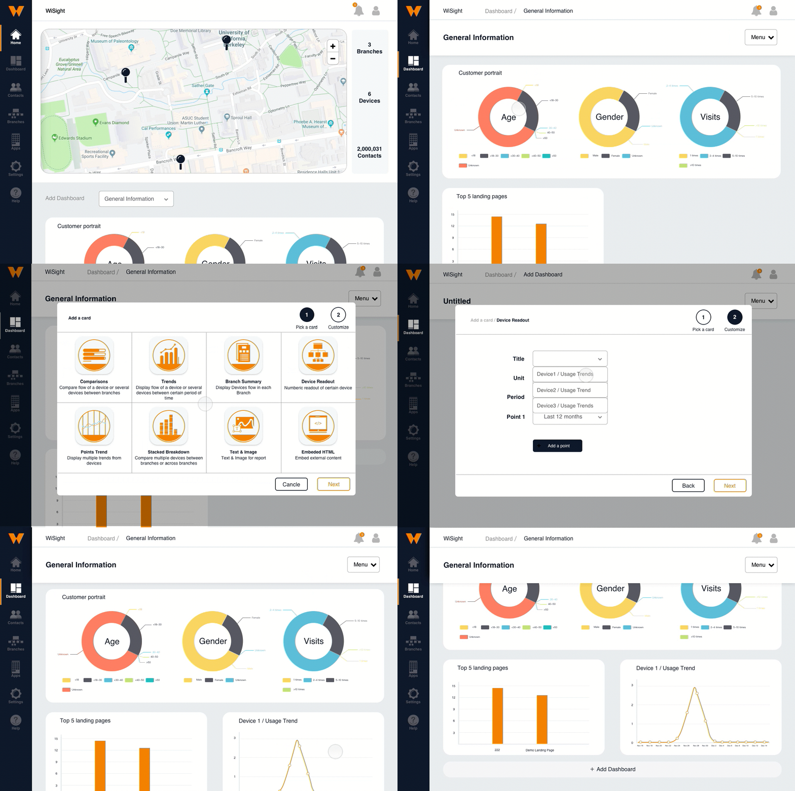
We divided the dashboard into two separated menus.
-
From the "Home" menu, the administrator can create their own dashboard and choose the one that they think important for their current business.
-
From the "Dashboard" menu, users can easily manage the dashboard quickly and directly.
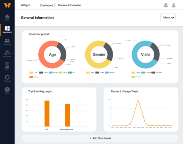

Design Improvement 02:
The "Dashboard" menu, we adjust a set of design to call the users acting with. We identified eight commonly used graphs for the start panels to allows users can intuitively overview the functions and getting a quick start.

Coustomer End Case Study –
What do customers like? Why is it important for our product?
From the beginning, our team keeps discussing our research direction. After we talked to the PM, we realized that only interviewing the business users is not enough because we would not know what our C-end customers want. If the customer were feeling uncomfortable with or overwhelming by advertisements, the retention rate would decrease. The relationship between C-end customer and B-end users should be one of mutual Influence.
We are analyses customer's behavior to improve our product design. We asked ourselves what design features could optimize business user benefits and balance distinct business goals with C-end customer needs.

Data from user interview

Key factors that user concerned

Data from user interview

Key factors that user concerned
After we gathered all the data, we faced a serious question: what could we do? if C-end users have a strong desire not to signing in to WIFI services using personal social accounts, it would cause difficulty for the C-end user to respond to questionnaires and reduce the attractiveness of the landing page.
We took these findings into consideration as we looked at the composition of our design. We provided adjustable templates and efficient layouts for B-end users to quickly build their own Wifi pages. It improves efficiency when B-end users respond to C-end customers quickly with a correct direction.
Problem Indicated Form Old Version:


First time users are hard to understand this separated Portal menu and locate the feature that they wanted
When user design their landing page, they found it hard to understand where and how to launch
Improvements 01: Display the editing process in one page
We decided to make the whole landing page process more efficient and easy to edit so we put all steps into a one-page display.
Also, we added a down arrow at each step that gives a clear visual guideline alerting users that the can access a drop-down menu while editing and finishing up their pages. Users can display or hide this information to their customers.
Finally, we designed a progress bar on the left-hand side which led users to understand where they are in the process.

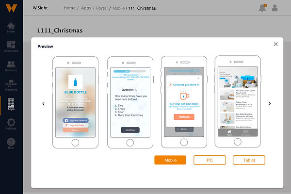
Improvements 02: Preview